- Home
- Papercraft Adhesives
- Design Layouts
Design Layouts
Written and Created by PaperCraftCentral Susan
When you first realise you need to design layouts when scrap booking or card making, this can feel very daunting. But it does not have to be!
"Memories are like sand castles
only by putting them in a safe place
can you prevent them from washing away".
~Author Unknown

You may have asked yourself if you need to be an artist or graphic design artist in order to be a good paper crafter?
Fortunately, the answer is no, you do not! Scrapbooking and card making is a very personal craft, and really, whatever pleases you is right and good for your own work.
There are some basic principles of design that could be of use to some of you at times though, so I am going to list some of them for you here. I know I like to read through this list whenever I have a page that seems to be missing something, or seems to lack balance, or I just know something is wrong with it but cannot immediately tell what it is.
How I Design Layouts
Maybe having a list of elements of design available will help you in the same way that it helps me.
When it comes to creating a pleasing scrapbook or card layout, I have discovered this:
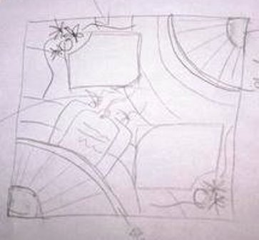
- Making a triangle shape with your elements somehow pleases the eye
- Using odd numbers of flowers or other embellishments is more pleasing than using even numbers
- It helps to have a focal point on the page - something you want people to notice first - so you embellish that one thing more than you embellish other bits of the page
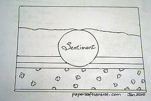
- Lines help to 'organise' the page somehow. The eye naturally follows lines so if you make a line with cardstock strips, ribbon, lace, or even a row of pictures, you will draw attention to that spot on the page
- The Rule of Thirds means dividing the page up in thirds (in your mind) as a way of balancing things. Divide your page up vertically and horizontally in your mind, then place your main picture on one of the points where the lines intersect
- The eye is also drawn to sparkle, so use glitter, shimmer, pearls or crystals where you want people to look
- I also look for things in the photographs that I can use as embellishments: is the person wearing something with shapes on it? I use those shapes in the embellishments Are there flowers in the photo? I use those colours and even those flower shapes to embellish Is there a dominant colour in the photo? I use that colour and complementary or contrasting colours in the embellishments.
- Matting or outlining your main photo or page edges really seems to finish things off nicely
Stephanie from Expert Village says what I am trying to say and shows you visually how to apply some of the things I have listed for you:
For Those Who Want More!
For those of you who want more information about how an artist thinks so you can apply it to design layouts, here are the Elements of Design, according to John Lovett, a mixed media artist:
- Line
- Shape
- Direction
- Size
- Texture
- Colour
- Value
Then he lists the Principles of Design:
- Balance
- Gradation
- Repetition
- Harmony
- Dominance
- Unity
Each of the listed items is expanded with pictures on John Lovett's
website, so do read further if you think it will help.
I hope this page has helped you feel more confident about how to design layouts for your cards and scrapbook pages.
Remember, in spite of what I have written here, the rules of design are made to be broken, and it is the page that pleases YOU the most that you are looking for in the end. Yes. Really.
Return from Design Layouts to Scrapbooking Tips | Return to PaperCraftCentral Home Page


New! Comments
Have your say about what you just read! Leave me a comment in the box below.