- Home
- Papercraft Adhesives
- Double Layout
Double Layout Ideas
Written and Created by PaperCraftCentral Susan
A double layout can make quite an impact in your scrapbook album especially when you have a few photos you want to scrap.
"Whoever said you can't buy happiness forgot little puppies"
~Gene Hill
Lately I have been drawn to scrapping two coordinated pages at once for my
albums. I used to find it hard to do these and also a bit daunting, but
now I love the extra space and freedom to develop an idea that it allows.
I
have also noticed that scrapping this way helps my album to look much
more coordinated. Making two pages on the one subject that link together
makes quite a great impact for browsers of your album, I believe, especially when you have such
cute pictures to work with in the first place. It just looks good!
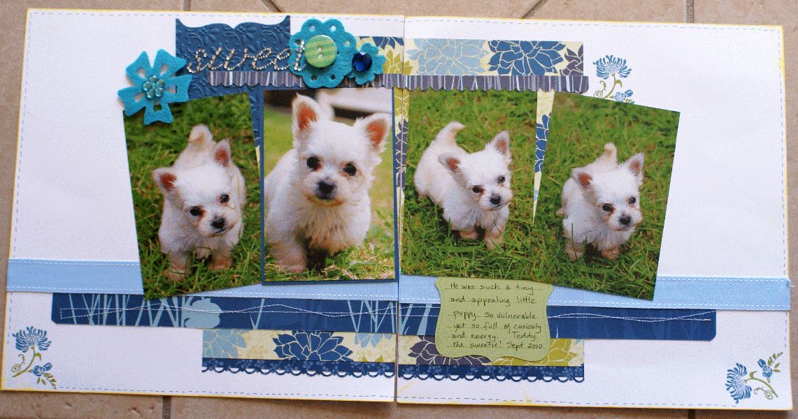
I made this set of pages for my Dog Scrapbook, of course, but imagine these pages with your favourite baby photos or with portraits of your family?
These types of layouts are especially good when you have taken numerous photos of a special event. You can spread them out over two pages and tell a story that links them all together.

How I Made this Double Layout
In this case, I did use a sketch given to me at a scrapbook retreat I was attending. Unfortunately I do not know the name of the sketch maker, but my pages should give you a good idea of how it originally looked.
I loved the idea that I could use four photos together like this and really only had to choose the one I wanted to be a little more prominent than the rest.
I chose two 12" x 12" pieces of Basic White Cardstock to create my layout. I thought it would make my puppy stand out if I then chose deeper colours to make my elements for the pages and also the mats for the photos.
I matted the main photo with a deeper blue cardstock (the second photo on the left). I left the other three photos without mats. You could choose something like Night of Navy or Misty Moonlight, for example.
Then I needed to choose my designer series paper. I selected ones that had blues and greens in them to allow the white of the puppy and the background to pop.
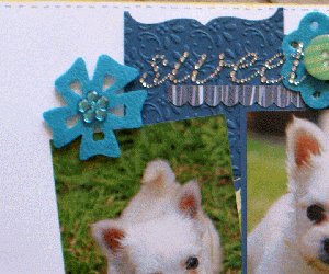
You can probably see that I used retired Stampin' Up! designer series papers and cardstocks and my Big Shot to emboss a piece of Marina Mist cardstock (retired) at the top left. Maybe choose Boho Blue cardstock? I used the Vintage Wallpaper embossing folder (retired) for that one.You can perhaps use one of the Basic 3D Embossing Folders instead.
HINT: To help you keep
the pages matched up in the middle while you work on them, lightly
adhere them together on the back before you start to scrap with a few pieces of
removable Washi tape, or use removable glue dots and some scrap paper to keep them from
separating. Then remove the glue dots and paper after you have completed your pages. This helps you get everything straight when you carry an element right across both pages. It helps the human eye to travel across the two pages and make them into one seamless whole.

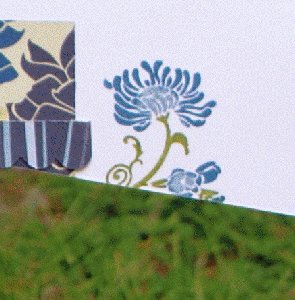
I used my Stampin' Write markers to colour up the Friends Never Fade stamp (retired) itself for the background so I could get different colours for the petals and leaves from one impression of the stamp. Choose a stamp set that you like, with perhaps flowers and leaves, or something else to compliment your photos and Designer Series Paper.
I stamped those images directly onto the white background cardstock after I placed my photos on the page and knew where i was going to place my border papers.
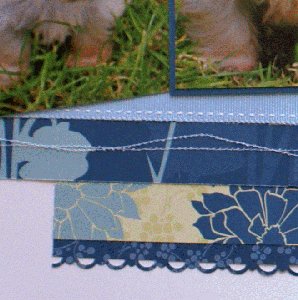
The stitched ribbon was also in my retired stash of Stampin' Up! products.Choose something that coordinates from your own stash.
The beauty of seeing an example like this is that you can CASE (Copy and Share Everything) it and use your own supplies instead. Choose colours that suit your own photos and events.

I actually used a sewing machine randomly along one strip at the bottom of the pages and my scallop edge and scallop trim border punches (both retired but there are plenty of current dies available that might suit your purposes) to make other strips more interesting.
The felt flowers, buttons and bling were also in my stash, origin unknown! You can always make your own paper flowers in coordinating or contrasting colours for your own layout.

If you make a double layout that you would like to share, I would love to see it. You will then have a page of your own at PaperCraftCentral.com and inspire other crafters too.
Do You Have Scrapbook Page to Share?
Please do share your scrapbook layouts and projects below.
Retutn to PaperCraftCentral Home Page


New! Comments
Have your say about what you just read! Leave me a comment in the box below.