- Home
- Papercraft Adhesives
- Designing with White Space
White Space Design Tutorial
Written and Created by PaperCraftCentral Susan
Making a White Space Design for your scrapbook page or card can result in a very balanced and focused effect.
"In page layout, illustration and sculpture, white space is often referred to as negative space. It is that portion of a page left unmarked: the space between graphics, margins, gutters, space between columns, space between lines of type or figures and objects drawn or depicted. The term arises from graphic design practice, where printing processes generally use white paper."
~Wikipedia
It's All About Balance, Not Blanks!
I used to think that White Space was blank space.
As soon as I heard the term, I thought I had to have a white background whenever I used this idea, but how wrong I was.
Isn't it funny how you get these ideas?
Thankfully I have some wonderful paper crafting friends who often show me the way with new techniques and ideas. That's what happened with this idea.
How My White Space Design Happened
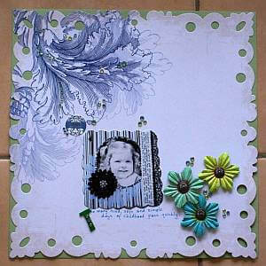
The scrapbook page layout above was my first attempt at using negative space.
You can see I still stuck with a pretty plain paper. There is some texture on the background page but mostly the area that is un-decorated is blank.
It is an extravagant gesture to use this type of technique. I'm game to 'waste' that space and leave it unadorned. That implies a lack of economy. It says I think the image is much more important than the paper, as that is where your eye must travel when looking at this layout, right?
Well, that's the effect I was aiming for anyway I hope you are noticing the cute baby photo of me instead of the background blankness!
White space and patterns
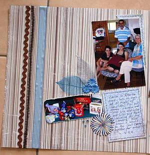
Here I got more daring with my background paper. I chose some pages with stripes for my negative space.
Can you see how it is still a simple layout, even though there is a pattern in the background?
There is space between the borders as well.
The focus is still the photo and the embellishments around it, and also the journalling spot. I've put the three elements together so the eye melds them together into one piece.
Again, I hope I achieved the effect I was aiming for.
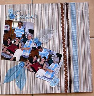
I carried this idea across to the other page of my double layout and kept the photos and embellishments together again.
The white space design is continued as a mirror image. I was hoping that I created a sense of balance with these pages with this strategy.
Did I do that for you?
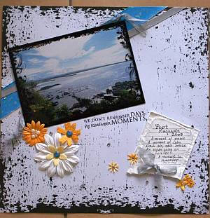
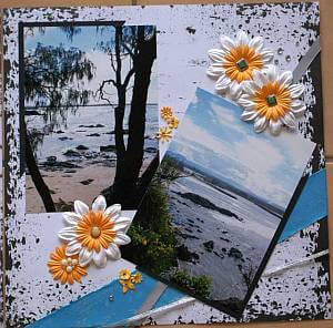
Next I decided to try the technique with some landscape shots of a very special place. The photos are of the beach at Port Macquarie in New South Wales, Australia. This place is special to my family. The photos looked so serene and calm, I thought a white space design would suit them to a 'T'.
I used a similar approach with this layout to the one with people in it above.
Again I grouped the photo with the embellishments but this time I overlapped the angled border embellishments with the photo.
The flowers are my way of asking the eye to travel on a particular course across the two pages, from the photo on the left to the journalling....
...and on to the photos on the next page.
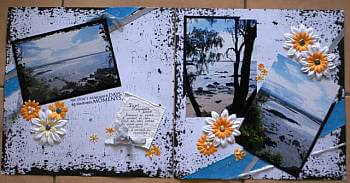
Here you can see the full effect of the design. I hope you can see what I was trying to do. It even manages to look kind of windy to me, which it was on the day I took the photos.
The simplicity of the background hopefully calls attention to the photos.
By the way, the colour of the flowers was taken from some tiny blooms in the grass in one of the photos. I like blue and yellowy-orange together as well.
White Space Design on a Card
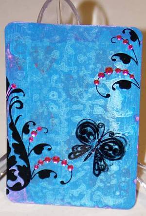
Finally, here is the technique used on a large playing card sized piece.
We made these cards for each other at a special crop I went to. Each person at the table I sat at contributed to the embellishment of the card.
As we were learning about white space design, is it any wonder that this technique was used on the card?
It is a painted background that I achieved by using Rainbow Rain Paint Daubers. This paint is very shimmery and opalescent so it was easy to add some pretty embellishments and not cover it all up.
I love the way this card turned out. I think the un-decorated areas are completely balanced by the black rub ons, pink crystals and black, Stazon stamped, acetate butterfly.
It needs nothing else, in my opinion.
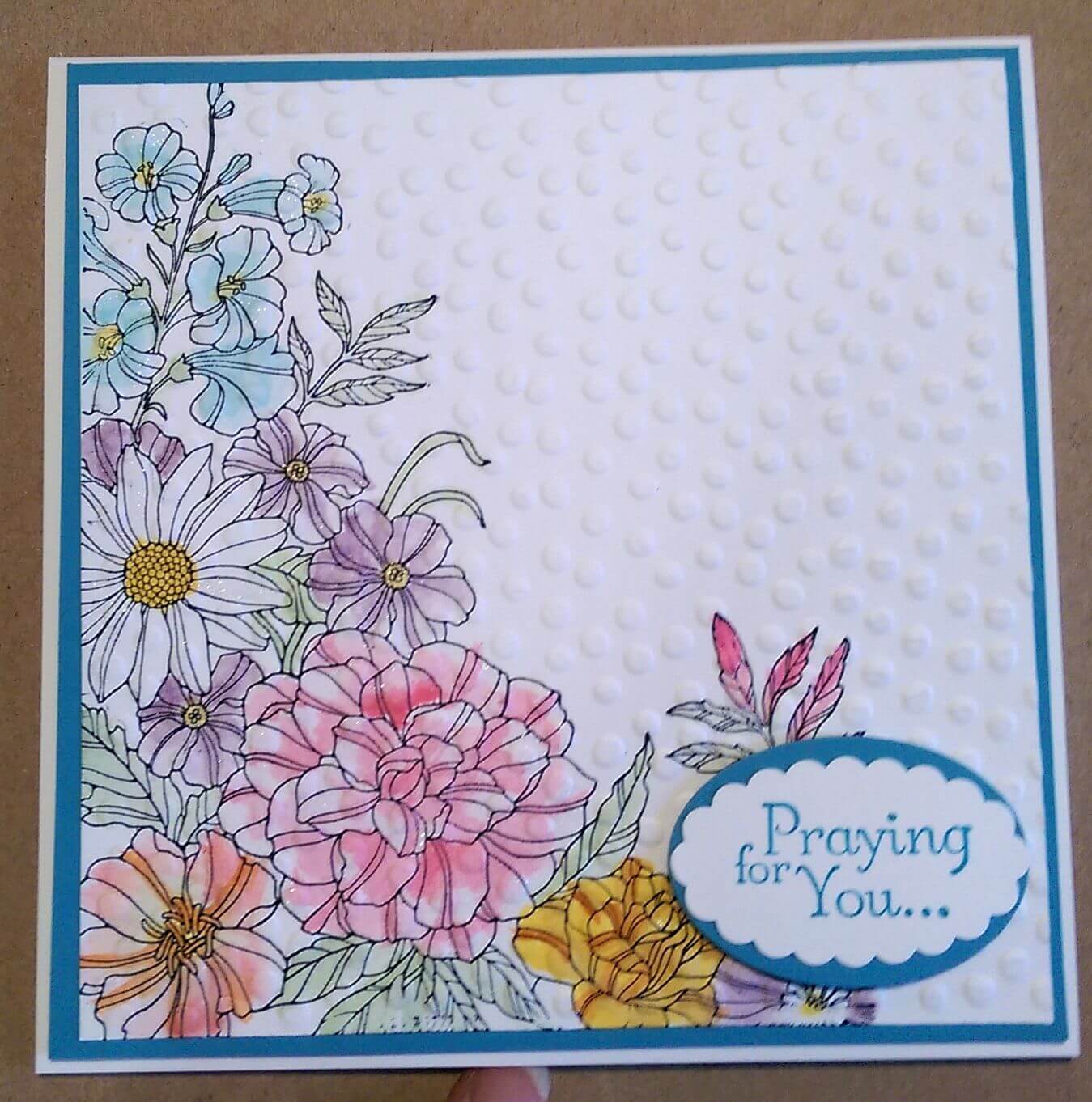
Here's another card using white space design:
Your Turn!
If you have made a project using a White Space Design, would you share it with me? I would love to see more examples of how people use this technique and it would really benefit scrappers and card crafters who are just starting out to see more work than mine too.
I'd also love to see your first attempt at using this technique. I was brave and showed you my first go. Will you share your first attempt with me too?
And of course, if you upload your layout, it's another way for YOUR work to be published.
Do You Have Scrapbook Page to Share?
Please do share your scrapbook layouts and projects below.
If you enjoyed this technique, you might like to try watercolouring or glitter embossing next.


New! Comments
Have your say about what you just read! Leave me a comment in the box below.